Colour and Contrast
All colour is perceived through the light, the light is white.
Rods - convey shades, black and grey
Cones - the brain perceives the corresponding colour
Contrast of tone: the difference between light and dark
Contrast of hue
Contrast of saturation
Contrast of extension
Contrast of temperature
Complimentary contrast
The stylisation of this typeface is quite minimal, the letters are squashed together to create the type face. The production of this typeface must be stone, as it is a serif font. The overall logo is copyright to the brand because of the juxstapositioning of the orb and the text.
Spectral Colour
The eye cannot differentiate between spectral yellow, and some combination of red and green
RGB - red, green, blue
CMYK - cyan, magenta, yellow, black
chromatic value = hue + tone + sauration
reduce chromatic value = desaturation
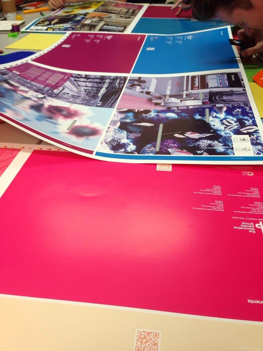
pantone is the colour codes
colour has to work systematically
During this session, we all placed the collected objects in order from dark to light. When the sequence was complete, it was clear form colour to colour how the shades and tones blend into one another.
During this session, we got the pantones out so that we could colour match specific objects. The pantone allows us to know the exact code for that specific objects colour.
jn