This sans serif typeface is clean, simple and does the job. The mulberry typeface helps create a corporate identity, and the line and stroke weight is consistent throughout. Even though the typeface is minimal, it provides an effective brand identity as the clean cut letterforms are both readable, and legible.
Thursday, 31 October 2013
Type Journal
This sans serif typeface is clean, simple and does the job. The mulberry typeface helps create a corporate identity, and the line and stroke weight is consistent throughout. Even though the typeface is minimal, it provides an effective brand identity as the clean cut letterforms are both readable, and legible.
Tuesday, 22 October 2013
Design Principles
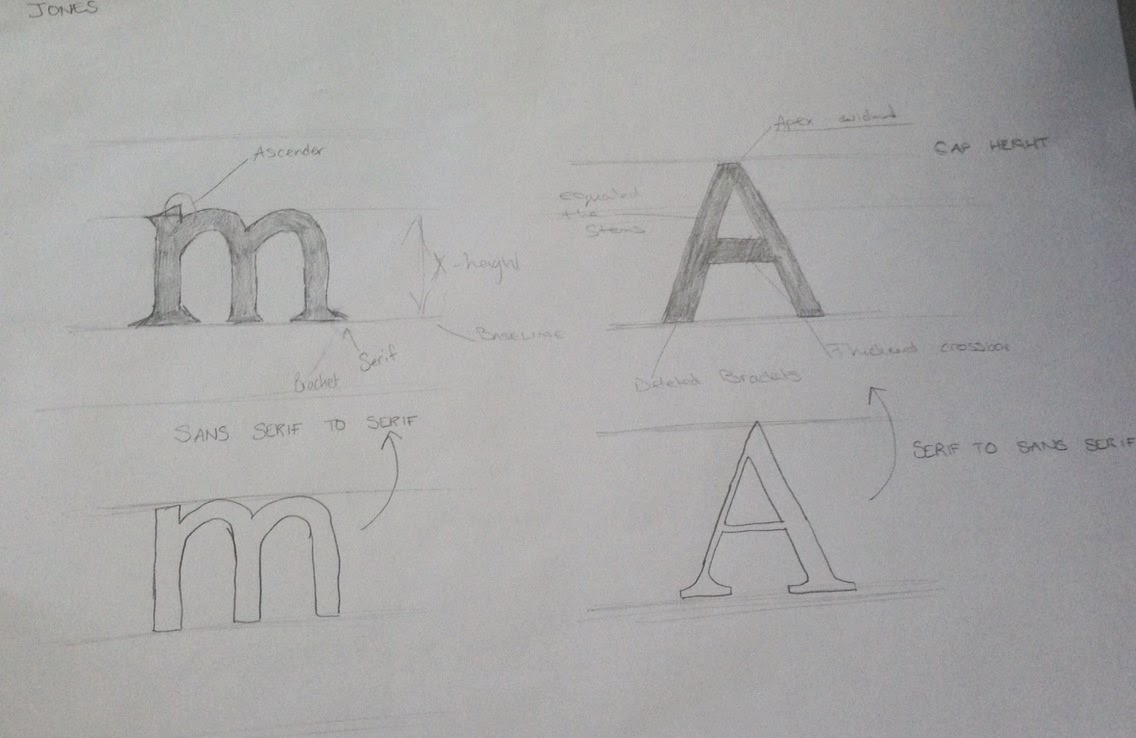
Anatomy of type


In todays session we looked at understanding connotations and the origins of typeface.
Origins:
Productions, anatomy, identity and character
Productions:
stone
sable
bone
lead
silicone
handmade
Anatomy:
serif
line/stroke weight
consistency
curves/apex
case
terminals
orientation
letter space
height
Identity:
chronology
mass produced
context
name
body text
Character:
industrial
geometric
bold
symmetrical
corporate
feminine
decorative
simple
Tuesday, 15 October 2013
Design Principles, Studio Practice
During this first session, we were introduced to the module design principles.
- process of visually communicating
Key Elements
type
readability
legibility
colour
type and image
frame
layout
composition
format
The aims are to introduce and explore the fundamental principles of visual literacy, colour theory, typography, layout and format.
Subscribe to:
Comments (Atom)