STUDIO BRIEF 1 EVALUATION
This brief was one of my longer briefs as it
required a large body of research in order to create the final publication, as
it was an extension from Cop, I had already considered the concept. The
finished publication shows a showcase coffee table style book that documents
the transition in fashion photography. This concept has clearly been
communicated through the use of layout design and print, I feel that the brief
has fulfilled what I intended to create.
The research in the initial stages of this
project has become irrelevant to the final publication itself, however this
shows the extensive development of research and ideas that I have gone through
in order to complete my final publication.
The physical publication displays a
minimalistic style of design, with a simple colour scheme, the publication
communicates sophistication through the use of simplistic layout and striking
images, the photography included speaks for itself, the impact that the
individual phots have is important. I feel that this publication successfully
informs the reader of how styling within fashion photography has changed and it
visually communicates the transition through that I have selected.
Overall I am pleased with the outcome of the
publication, I feel that I have successfully completed the brief to its full
potential, and as an extension of cop, it allows me to focus more on the rules
of layout and how I can apply these to my own practice.
STUDIO BRIEF 2 EVALUATION
This collaboration brief was a larger brief
that was completed over a long period of time with Beth Taylor, we produced a
botanical identification hand book. The final publication exceeded
expectations, the layouts are both visually pleasing, and informative, the
publication fits into the market that we intended, young professionals
interested in wildflower. The publication caters to a higher end market, as the
beautiful book not only has a purpose, it is something to keep as it is so
decorative. The combination of illustration and typography works really well
together, this is something Beth and I were unsure about how they would work
together, after creating mock ups and test prints we both agreed that once the
final watercolours and typography were completed that the spreads will be
visually pleasing. Beth focusing on type and myself on illustration, we managed
to achieve a good balance of work load, still both giving each other feedback
on the separate elements that needed to be completed. The style of type was
discussed before Beth began designing, we set out to create an elegant typeface
that resembled the font Baskerville, and this was achieved by Beths great
efforts and it worked out really well.
The colours within the publication are kept
simple, the illustrations provide enough colour for the pages to be printed on
white stock, we opted for a matte stock with a slight sheen, which once we had
professionally printed, allowed the illustrations to be shown in their full
colour.
We chose to get the publication out sourced
for printing and binding as we both agreed that the final publication needed to
be printed as highest standard possible.
STUDIO BRIEF 3 EVALUATION
This brief was set by
Kieron, it was intended to be a small brief, however I wanted to develop this
and create something that could be developed into another brief. The poster
that I created needed to link with the posters designed by the other two creative’s,
as the concept behind the groups we were set was based on our individual style
of practice.
My poster showed a
decorative design, including different medias and processes, using both paint,
drawing, and digital design combined as one. The poster does not have a concept
therefore I was able to create a design any way I wanted. I completed this
project just after the context of practice module and allowed me to get rid of
my creative block, which is why I wanted to produce something that looked
visually pleasing and not concept driven.
The combination of
watercolour and digital works really well, with the illustration and I am
pleased with the overall design, it also worked well on the large scale that
was printed for the weekly exhibition.
STUDIO BRIEF 4 EVALUATION
This brief being an extension from the
triptych brief allowed me to create a series of designs that in context, could
be seen next to each other, similar to the original triptych brief, but three
of my own designs. The designs use the same floral illustrations, but each one
applied to a different digital illustraton. The design works across three
variations of the poster effectively, and the designs show my visual research
in existing floral and anatomical illustrations.
These posters work well as a set of three,
the same colours are used for each design to keep them in sync. The colours
used are generally feminine which aims the prints at a female audience they
have been kept consistent throughout the whole series of prints, using the same
muted pink tone for the back ground.
STUDIO BRIEF 5 EVALUATION
This brief was to create a corporate brand
identity, as the business has a professional reputation, the client insisted
that branding resembles this. I feel that the brand identity that was produce
effectively communicates profession, and efficiency which is what the client
asked for as their image must be kept respectful and professional. The final
logo created just uses type to communicate what the brand does, the combination
of typography used work well together, creating a legibile logo that has an
impact. The larger ‘aw’ is the fical point of the logo, which then allows the
eye to read further down and discover what the company is/does.
Overall, I am pleased with how the brand
identity has turned out and the client that this was created for was very happy
with the results, he immediately put the new logo into use and sent me back a
copy of one of his invoices from a recent job which included the branding I
created.
STUDIO BRIEF 6 EVALUATION
The brief was to
create a new brand identity for the online beauty product seller Sarah Keeley
‘Loved Buy SK’ and produce a logo that can be used across her social media
accounts.
The feminine logo
created was hand rendered turned digital, I showed her this before going any
further with the project and she loved how the lettering was so decorative and
elegant.
For the physical
business cards the idea was to foil the logo on the front and have the contact
details printed on the back, due to the ink from the printer, when it came to
foiling it did not work as well as I had hoped. The heat press must have been
too hot for the ink that had been printed on the digital printers, if I had
more time then I would have re printed these cards and searched for stock the
colour I printed them in, however due to these time restraints and how busy the
screen print room was I was unable to recreate the cards; now I know that if I
intend to foil then I can’t print digitally first it must go straight on to the
stock.
Overall I am pleased
with the aesthetics of the branding, the hand written thank you cards add a
personal touch from Sarah to the customer, and therefore achieves customer
satisfaction, it is always nice to receive a personalised card.
STUDIO BRIEF 7 EVALUATION
This
brief was completed over a long period of time, as the main concept behind the
brief was the design process. Collaborating with a printed textiles student,
the main bulk of the brief was to complete a body of work that followed the
design process of a printed textiles student, which includes drawing, digital
manipulation, creating repeat patterns, fabric samples and also how these can
be shown in context as interior design. I feel like I have completed the brief
to a high standard, creating print designs that are versatile and can be used
across a wide range of materials including interior furnishings, stationary,
gift wrap and general prints.
For
this brief, I created my prints with the help of Katy, who showed me how to
produce a seamless repeat pattern, then she led through her usual design
process with me. Beginning with crating repeats to be printed as a flat digital
design, right through to creating fabric samples, due to time constraints I was
unable to create my own soft home furnishings from the fabrics, I created,
however Katy told me that part of their final deliverables was to produce the
fabric samples and mock up how they can be shown in context, which is what I
have done.
To
extend this brief, I created a set of gift wrap from my prints, which works in
various colour ways, once these were printed the colours have saturated
slightly so they are not as I wanted them, If I was to reprint the gift wrap I
would tone the colours down.
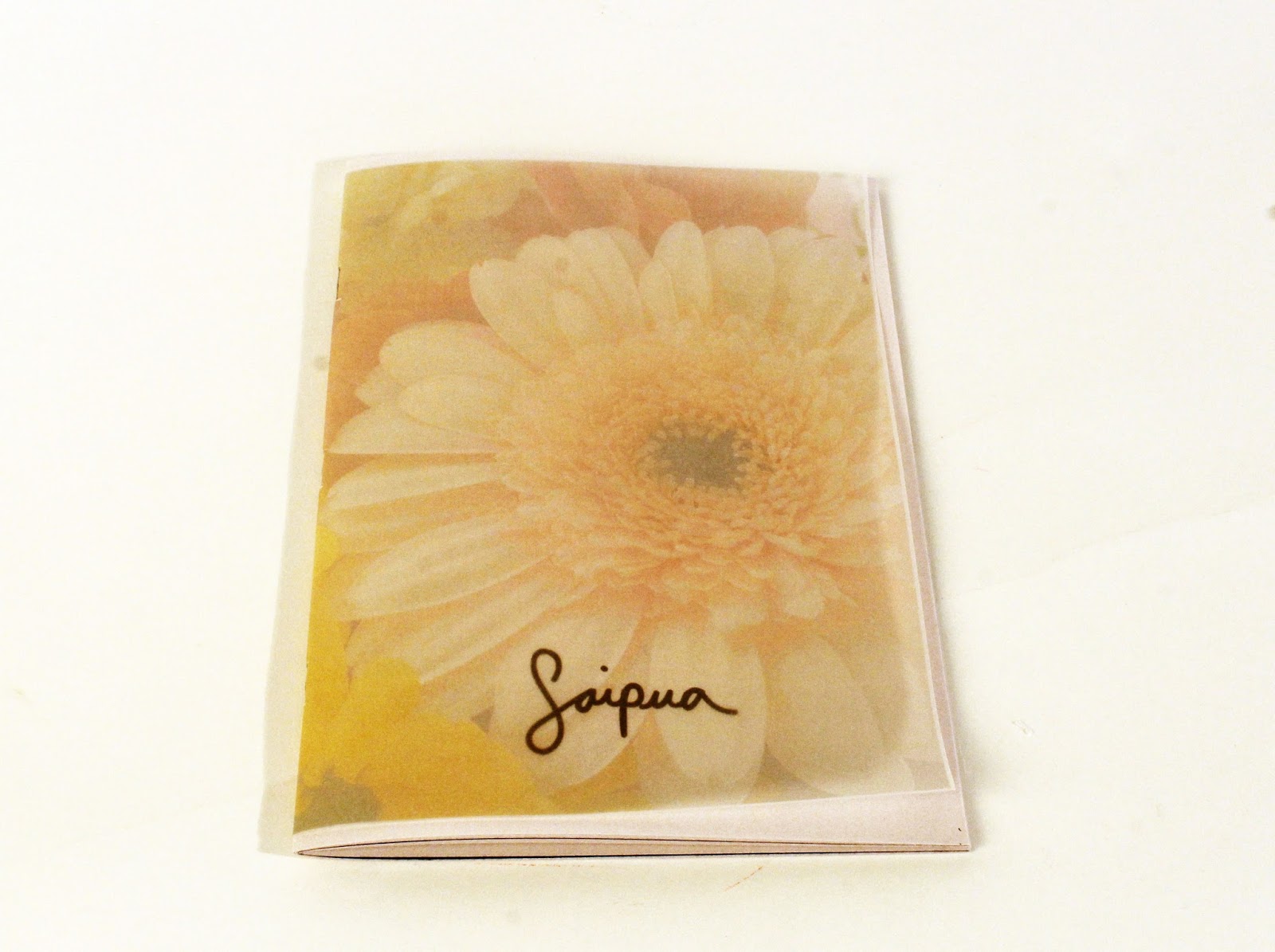
STUDIO BRIEF 9 EVALUATION
This
brief was to create a mini
printed portfolio for floral design Brand Saipua, the small floral arrangement
company who create beautiful displays and arrangements at events and shows.
Their online presence consists of a blog, shop, and online portfolio which
communicates their background in contemporary art; the task is to take their
online portfolio and create a printed mini portfolio that could be handed out
to customers and clients. I feel that the final portfolio I have created has
kept the brands styling with a simplistic approach to layout and colour. The
showcase of their work is presented clearly and simply in a small printed portfolio,
the final visuals communicate a delicate sense of style, and the publication
suits the brands identity, I am pleased with the overall aesthetics of the
publication.