These are four digital positives of the poster, they are all similar apart from certain alterations. I still need to develop this poster as neither of them are quite right yet.

On this the text below should be aligned and stretched to the full size of 'armageddon'


I think the text needs to remain within the lower shape, the text is far too large and the larger text overpowers the smaller text
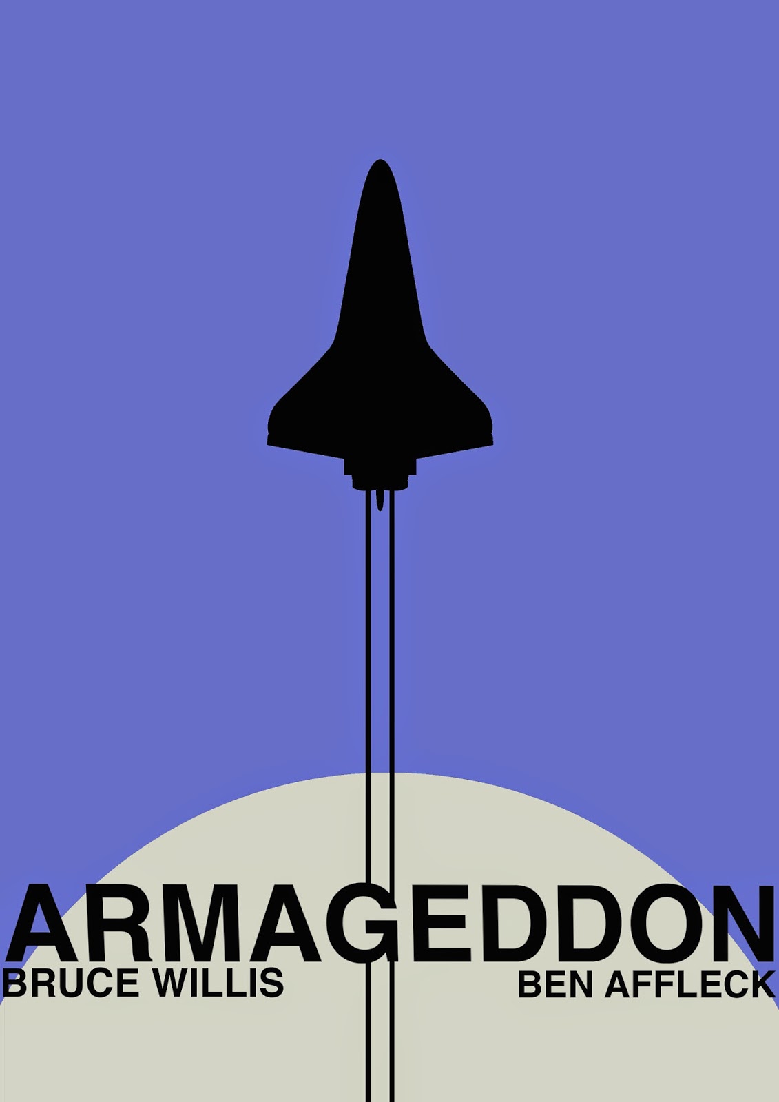
The shuttle lines should remain behind the bottom layer, it does not look good underneath the text.
No comments:
Post a Comment