For the publication, the layout will be consistent throughout with slight variation to certain spreads to offer an interesting layout.
The layouts shown in the research show the use of negative space alongside full bleed images.
Van de Graaf
Researching into different grid systems and layouts, the van de graaf was chosen to create the basis for the layout as the centralised page proportions create a harmonious balance. Here show the van de graaf proportions and how text will be applied, and also the proportions that have been divided for this
Publication.
Creating my own template for the van de graaf


Change this page slightly before print (layout of images)


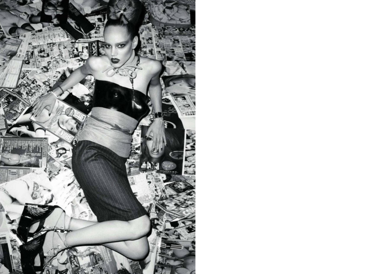
Remove this shoot and include other one instead


Putting the collection of visuals into an appropriate layout is what will achieve the aesthetics of the publication. The van de graaf canon allows the spreads to be split equally, which creates a harmonious balance between the pages. This layout shows the text/image proportions are facing towards the spine, and they do not cover the whole height of the page.
Due to certain images being different proportions the canon will be used as a basic structure for the publication, this then allows for certain pages to break the rules of the canon, for example when using a full bleed image, or for smaller images that can be placed nearer or away from the spine.
Aesthetics
To keep the minimalistic style of the publication consistent, the colour scheme for this must be kept simple in order for the visuals to speak for themselves. Minimal text is required also, as the photography will be the only visual communication needed.
To allow the photography to be clear, an off white stock for the pages will be used, and for the cover of the book, a plain cover with only the title seems most appropriate for this style of book as it needs to be kept clean and concise.
For the cover page and title pages introducing the photographer, a serif style font that resembles those of a fashion magazine will be most suited to this publication, the font Didot in bold is a classic font seen in many fashion publications, the elegant serif offers a decorative yet legible style suitable for headings. Body copy will be kept simple, using the sans serif font Avenir.

No comments:
Post a Comment