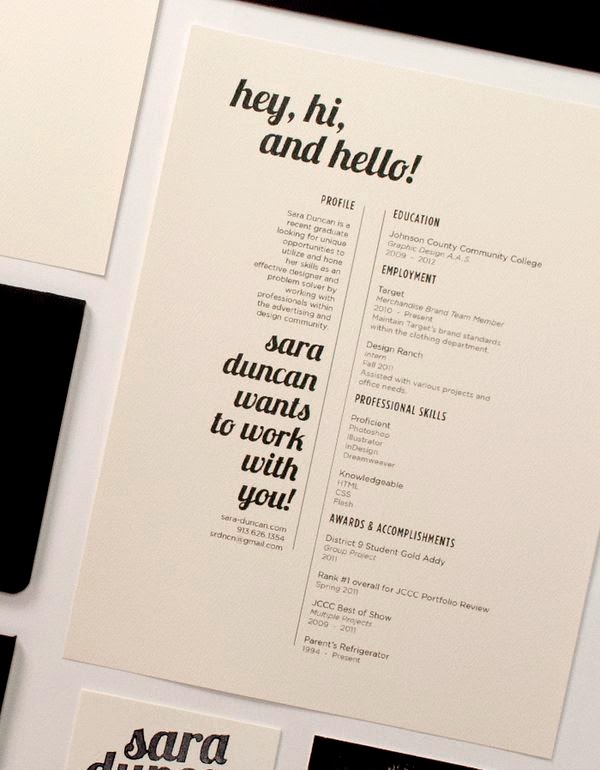
Overall I have enjoyed this as a module as a whole, however I feel that I have slightly let myself down on the analysis side of things. I have enjoyed producing a wide body of work that I haven't really considered doing before, such as branding for other creatives and competition briefs. The module has opened my eyes in respect of the mass of work that can be produced if you really explore with both concept and design developments when experimenting with different processes, and when you choose your own briefs it is much more enjoyable and does not appear as a 'task.' I have learnt that timekeeping, planning and self organisation is crucial, because the module has been ongoing for several months, I have realised that experimentation and development never ends, as there are always certain ways you can add to and improve your work, a project in my eyes will never be finished. From my experience completing this module, I wish I had of planned my time more effectively, as looking back it seems I have applied more understanding and development to some smaller briefs rather than the larger ones which needed more focus. With the module occurring over a longer period of time than usual, I felt that I was rather lazy with my work ethic as I thought there was more time than there actually was, I don't feel that I have excelled in this module and once again I am slightly disappointed with the overall submission.
Blogging was one of the things I feel has let me down as I didn't keep on top of the blogging, distracted by other modules ongoing at the time, to improve this I need to make sure that I can determine myself to write a couple of blog entries daily rather than weekly, my blog should be able to show exploration of my ideas and design process from the initial stages right through to the more refined stages, including problems and issues occurring along the way. This is something I will definitely focus on for the further modules in the future, I also need to improve on my critical, analysing skills significantly as I feel this is what lets me down severely. In order to improve this, I need to set aside some designated time at the end of the day to blog about what I have done, as most of the time I feel like I keep everything stored in my head or noted down, but leave compiling my blog until last minute, which never works out well.
When working on each individual brief, I did enjoy the freedom of choosing briefs we wanted and because the briefs were so open, I enjoyed experimenting with different processes than I usually do. For the collaborative brief, my partner who studies on the printed textiles course, chose the D&AD brief 'Wetransfer' and I really enjoyed working with her on this brief. Working with Katy allowed me to explore different design processes, which included screen printing. I know the basis of screen print, but working with Katy we managed to produce a more technical and intricate three layered print, which worked well. We were both pleased with the overall print, working with Katy has developed my skills within the print area, as I was used to creating the standard two colour prints. We also experimented with foiling, on to our print which brought in Katy's textile qualities that she has to offer, I really enjoyed this brief as it allowed me to get more creative and hands on, rather than just designing on screen. The range of briefs that I chose to work on required various skills and processes, allowing me to produce a broad range of designs ranging from digitally produced publications, screen prints, promotion material, wallpaper designs etc. Within this module I feel that I have shown a good variation when it comes to design methods and productions, however I don't feel that the strength of my developmental stages are present. The workload feels slightly rushed, and I have not produced it to a high enough standard.
I have enjoyed producing several briefs that are all very different, and I feel that I have gained knowledge from the module that I want to build on, but the main improvement to focus on is my analysis and understand of design decisions.
Thursday, 26 March 2015
Wednesday, 25 March 2015
Digital submission
I have created a gif for the digital submission part of this brief, the concept was to show that In ten years time my creativity will still be present, however like the wilting flowers shown, there will always be growth then the ideas that have been developing slowly fade. This reflects me, as I am forever changing my opinion during my design process, and no matter how nice something my look the organised mess can consume me as an individual.

Monday, 23 March 2015
Development
Making origami flowers:


Want to create a gif for the digital submission to represent me in ten years. Still has a strong concept/direction however nothing is ever organised, however the unorganisation has a clear direction, ideas are constantly developing and growing. This suggests that we are unsure what is going on during our design process, when creating, however there is always a refined solution in the future. The flower represents the growth then deterioration of an idea. Then the process is repeated.


Friday, 20 March 2015
Development & final
Creating the promotional material
I selected some of Katys best work, and what I thought represented her as a designer allowing me to create a colour scheme. To get a sense of Katy’s style within the branding identity, I decided to include a small hint of her design, unlike Katys existing branding that features a design heavy outcome.


I selected some of Katys best work, and what I thought represented her as a designer allowing me to create a colour scheme. To get a sense of Katy’s style within the branding identity, I decided to include a small hint of her design, unlike Katys existing branding that features a design heavy outcome.
I have incopprated this small portion of design, which can be used on a business card and wihtin the portfolio booklet on some pages. The feminine typeface I have rendered is strong enough to stand alone, or with the design. This is how the logo and design have been used in context.
I chose several pieces of work from two totally different collections. For the mini portfolio, I have selected some of katys best work, and what represents her as a designer. I used a four column grid for the layout.
Applying it to the business card
Final outcomes
Thursday, 5 March 2015
Research & Development
Promotional material
Katy has asked me to produce her promotional pack including; a business card, letter head, and a small portfolio booklet containing some of her best work. To get a better idea of what she wanted me to produce I gathered a few existing exmples of promotional packs of behance and showed them to her.
Knowing what Katy wants the promotional material to include, I know what I need to begin to research and develop in order to create the most succesful branding identity I can. Before the design process begins, its crucial that the aims and objectives of this material are underlined. branding is a powerful tool and gives people a visual concept of Katy as a designer, the identity must maintain her style of work and reputation, the branding must reflect and display Katy’s personality and style of work. To promote her designs, a small portfolio/collection of work must be included in this package, contact details and FAQ letters are also crucial. The promotional material will be distributed to design agencies, showcasing some of her best work, the package will include; a business card, FAQ letter, CV/portfolio booklet and a selection of showcase postcards featuring some of Katys favourite designs, which she thinks represent herself as a designer effectively.
Katy has reqeuested that her identity is to be kept clean, simple yet with a beatuful aesthetic, choosing a typeface and font family to use in her promotional material is one of the design decisions with a higher significance, as the typography can have just as high of an impact as the graphic elements to the branding. With this in mind, I proposed the idea to Katy to create a soley type based logo, to keep her clean minimal theme present. This design idea was approved by Katy, as she liked the idea of her brand identity consisting of beautifully rendered lettering, that would then have the ability to acompany any of her work without clashing with the stlye of design, like her existing branding.
Identity research
Katy liked the aesthetics of the typeface for these branding, which gives me a good idea of what she is looking for.


Creating the typeface

From the initial sketches I got a rough idea of how I would like the type to look. Katy’s choice of typeface to style her branding on was Bodoni, so I traced the origianl typeface to see what a hand rendered style of the font would look like, however the serifs were not clean enough on my hand rendered version. I scanned this in and applied the live trace tool on illustrator, but again the finish was not clean enough. I was disappointed with the outcome as I wanted to create hand rendered type, instead the pen tool would be the best way to create the type for ‘Katharina.’


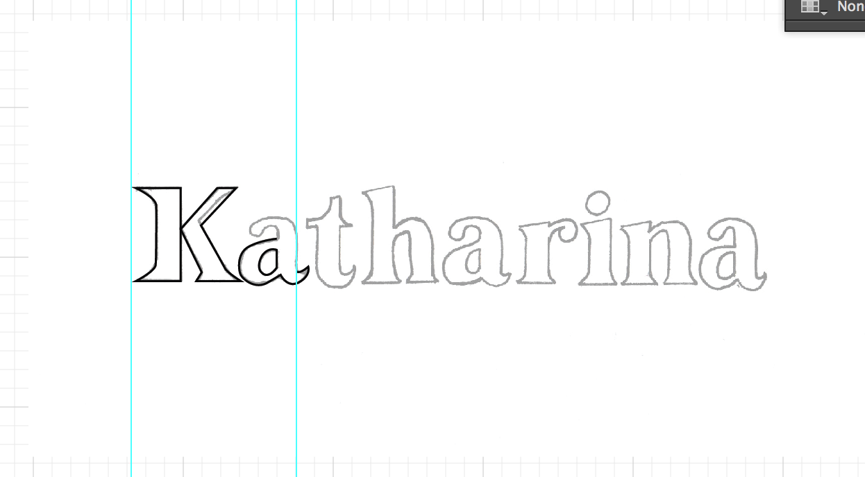


With katy requesting me to base her branding on the existing font bodini, I drew the font out slightly different to manipulate on illustrator. I want to make subtle changes such as the serifs and the weight.
I originally wanted to create something slightly more hand rendered however when recreating the font with the pen tool it did not work out as I intended.
Instead I decided to create an outline over the font itself, with a smaller point size on the pen tool. I found that this worked much better and gave me cleaner letterforms.
Finished 'Katharina'
Changed the weight and serifs. Katy was pleased with the final outcome
Branding 'Charlotte Lilly'
Brief
My friend charlotte asked me to put together some very simple zines for her, showcasing two of her fashion design projects. I took this on as this would be a very small and quick brief, as she had already specified some design decisions she would like me to consider. Charlottes diverse and unique sense of design will allow me to create such a simple design where her work can be the main focus. Charlotte provided the photos she wanted me to edit and include, and she also asked for a minimal, clean logo to accompany the work. This will be a very minor design task, as she has given me certain requirements and preferences, all my job will consist of is creating a brand identity and designing and producing the final publications. I want to capture the essence of charlottes style and personality.
Project one
Charlotte gave me a selection of images, allowing me to choose my favourite to edit and use.


Final logo


.jpg)
.jpg)

%2B2.jpg)

.jpg)

.jpg)


My friend charlotte asked me to put together some very simple zines for her, showcasing two of her fashion design projects. I took this on as this would be a very small and quick brief, as she had already specified some design decisions she would like me to consider. Charlottes diverse and unique sense of design will allow me to create such a simple design where her work can be the main focus. Charlotte provided the photos she wanted me to edit and include, and she also asked for a minimal, clean logo to accompany the work. This will be a very minor design task, as she has given me certain requirements and preferences, all my job will consist of is creating a brand identity and designing and producing the final publications. I want to capture the essence of charlottes style and personality.
Project one
Charlotte gave me a selection of images, allowing me to choose my favourite to edit and use.
Incorporating some of charlottes patterns and designs into the booklet.
Using 5 column grid for this layout.
Creating the logo, using the font Gill Sans (charlottes requested typeface)
Final logo
Final booklet 1
Booklet 2
Using a three column grid
Incorporated charlies pattern using a small strip on the page
Subscribe to:
Comments (Atom)