Showing posts with label 'Katharina'. Show all posts

Friday, 20 March 2015

Development & final

Creating the promotional material

I selected some of Katys best work, and what I thought represented her as a designer allowing me to create a colour scheme. To get a sense of Katy’s style within the branding identity, I decided to include a small hint of her design, unlike Katys existing branding that features a design heavy outcome. 
I have incopprated this small portion of design, which can be used on a business card and wihtin the portfolio booklet on some pages. The feminine typeface I have rendered is strong enough to stand alone, or with the design. This is how the logo and design have been used in context.


I chose several pieces of work from two totally different collections. For the mini portfolio, I have selected some of katys best work, and what represents her as a designer. I used a four column grid for the layout.

Applying it to the business card


Final outcomes


Thursday, 5 March 2015

Research & Development

Promotional material 

Katy has asked me to produce her promotional pack including; a business card, letter head, and a small portfolio booklet containing some of her best work. To get a better idea of what she wanted me to produce I gathered a few existing exmples of promotional packs of behance and showed them to her. 

Knowing what Katy wants the promotional material to include, I know what I need to begin to research and develop in order to create the most succesful branding identity I can. Before the design process begins, its crucial that the aims and objectives of this material are underlined. branding is a powerful tool and gives people a visual concept of Katy as a designer, the identity must maintain her style of work and reputation, the branding must reflect and display Katy’s personality and style of work. To promote her designs, a small portfolio/collection of work must be included in this package, contact details and FAQ letters are also crucial. The promotional material will be distributed to design agencies, showcasing some of her best work, the package will include; a business card, FAQ letter, CV/portfolio booklet and a selection of showcase postcards featuring some of Katys favourite designs, which she thinks represent herself as a designer effectively. 

Katy has reqeuested that her identity is to be kept clean, simple yet with a beatuful aesthetic, choosing a typeface and font family to use in her promotional material is one of the design decisions with a higher significance, as the typography can have just as high of an impact as the graphic elements to the branding. With this in mind, I proposed the idea to Katy to create a soley type based logo, to keep her clean minimal theme present. This design idea was approved by Katy, as she liked the idea of her brand identity consisting of beautifully rendered  lettering, that would then have the ability to acompany any of her work without clashing with the stlye of design, like her existing branding. 

Identity research 

Katy liked the aesthetics of the typeface for these branding, which gives me a good idea of what she is looking for. 


 Promotional material 


Creating the typeface 


From the initial sketches I got a rough idea of how I would like the type to look. Katy’s choice of typeface to style her branding on was Bodoni, so I traced the origianl typeface to see what a hand rendered style of the font would look like, however the serifs were not clean enough on my hand rendered version. I scanned this in and applied the live trace tool on illustrator, but again the finish was not clean enough. I was disappointed with the outcome as I wanted to create hand rendered type, instead the pen tool would be the best way to create the type for ‘Katharina.’


With katy requesting me to base her branding on the existing font bodini, I drew the font out slightly different to manipulate on illustrator. I want to make subtle changes such as the serifs and the weight. 


I originally wanted to create something slightly more hand rendered however when recreating the font with the pen tool it did not work out as I intended. 


Instead I decided to create an outline over the font itself, with a smaller point size on the pen tool. I found that this worked much better and gave me cleaner letterforms.


Finished 'Katharina'

Changed the weight and serifs. Katy was pleased with the final outcome


Wednesday, 4 March 2015

Branding 'Katharina'

Brief
I was asked to create a brand identity, along with promotional material by a student on the printed textiles and surface pattern course. The client came to me and requested that I rebrand her existing identity she had previously created herself, her style of work suggests that she uses experimental and traditional design values within her work. Her designs create a collective that has deatiled and unique patterns that have alot of depth, however she creates the perfect balance  between something that can be seen as overly fussy and too busy, and intricate designs and prints that form an overall conemporary approach. Katy my client, requested that I create her branding identity and promotional material that suits her overall style and characteristics. The existing branding she has developed shows Katy’s love for experimental and unusual style, however the branding could be simplified to create a more clean, modern approach, that is much more suited to Katys collection of work as a whole. 

Concept
After reviewing some of Katy’s existing work, her style and creative approach became clear, she uses both experimental and traditional design values and uses a technological approach. The majority of Katys current work boasts the ‘urban jungle’ theme, displaying various bold floral prints and strongly experimented pieces, with heavy detailing. For her branding identity, the idea of toning the overall style down slightly was a collaborative decsion Katy and I both agreed on, her intentions for the new bradning identity including a minimal style, and a cleaner aesthetic than her current branding. The promotional material must promote her as a designer, and not only something that looks professional, but it still gives the audience and potential clients a good understanding of her personal attrubutes and style of design. The overall design aesthetics need to meet my client Katys needs; giving the audience a clear vision of Katys strengths as a designer, but they must also be kept clean, minimal and concise. 

Katys existing personal branding:
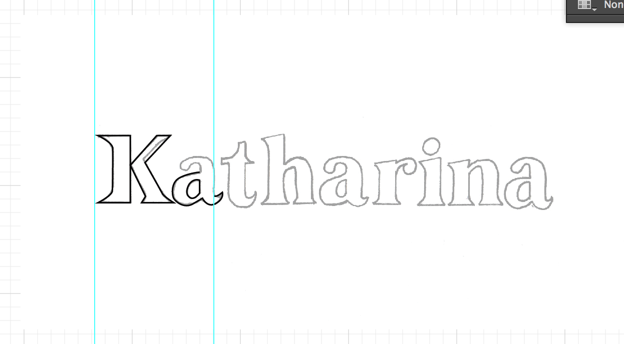
The design does not promote Katys skills and style to a high enough stanfard, the typography and approach of design needs to be altered substantially. The pattern shows Katy as a designer, and her apporach toward design, however there are more subtle ways of showing her style and inspiration. The choice of type does not fit the new brief specifics I have been given by Katy, as she wants a clean and durable design, something that will look classic when applied to any of her branding material. I want to create a typeface for her logo that will work with any of her pieces, therefor keeping it clean and simple is the most suitable approach to take.


Katy seeks to create designs that have depth, showing her influence through both experimental and traditional design values, which she translates in her technological approach to a project. Katy’s main influences are the work of Linda Florence, and Timourous beasties. With her dedicated, interested and passionate approach to design, Katy uses a mixture of painterly processes and digital manipulation to convey her prodiminantly floral motifs. Katy is looking to learn new and exciting techniques to give her work an appeak that will striek the young professionals who want a little bit of something extra in their domestic spaces. She has a gret love for drawing both hand rendered and digital, and Katy’s designs often present a detailed and crafted element which adds extra elegance to a design. Her main influence's are Linda Florence and Timourous Beasties.