Promotional material
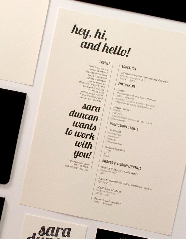
Katy has asked me to produce her promotional pack including; a business card, letter head, and a small portfolio booklet containing some of her best work. To get a better idea of what she wanted me to produce I gathered a few existing exmples of promotional packs of behance and showed them to her.
Knowing what Katy wants the promotional material to include, I know what I need to begin to research and develop in order to create the most succesful branding identity I can. Before the design process begins, its crucial that the aims and objectives of this material are underlined. branding is a powerful tool and gives people a visual concept of Katy as a designer, the identity must maintain her style of work and reputation, the branding must reflect and display Katy’s personality and style of work. To promote her designs, a small portfolio/collection of work must be included in this package, contact details and FAQ letters are also crucial. The promotional material will be distributed to design agencies, showcasing some of her best work, the package will include; a business card, FAQ letter, CV/portfolio booklet and a selection of showcase postcards featuring some of Katys favourite designs, which she thinks represent herself as a designer effectively.
Katy has reqeuested that her identity is to be kept clean, simple yet with a beatuful aesthetic, choosing a typeface and font family to use in her promotional material is one of the design decisions with a higher significance, as the typography can have just as high of an impact as the graphic elements to the branding. With this in mind, I proposed the idea to Katy to create a soley type based logo, to keep her clean minimal theme present. This design idea was approved by Katy, as she liked the idea of her brand identity consisting of beautifully rendered lettering, that would then have the ability to acompany any of her work without clashing with the stlye of design, like her existing branding.
Identity research
Katy liked the aesthetics of the typeface for these branding, which gives me a good idea of what she is looking for.
Creating the typeface
From the initial sketches I got a rough idea of how I would like the type to look. Katy’s choice of typeface to style her branding on was Bodoni, so I traced the origianl typeface to see what a hand rendered style of the font would look like, however the serifs were not clean enough on my hand rendered version. I scanned this in and applied the live trace tool on illustrator, but again the finish was not clean enough. I was disappointed with the outcome as I wanted to create hand rendered type, instead the pen tool would be the best way to create the type for ‘Katharina.’
With katy requesting me to base her branding on the existing font bodini, I drew the font out slightly different to manipulate on illustrator. I want to make subtle changes such as the serifs and the weight.
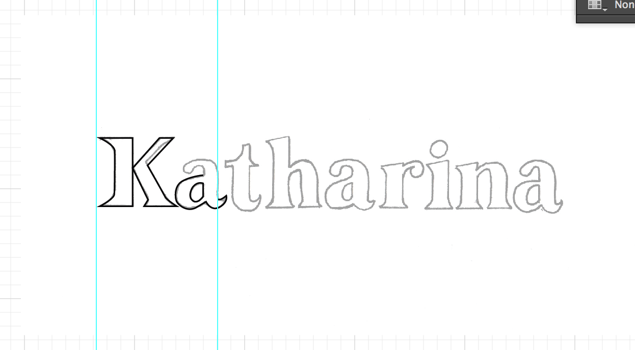
I originally wanted to create something slightly more hand rendered however when recreating the font with the pen tool it did not work out as I intended.
Instead I decided to create an outline over the font itself, with a smaller point size on the pen tool. I found that this worked much better and gave me cleaner letterforms.
Finished 'Katharina'
Changed the weight and serifs. Katy was pleased with the final outcome


No comments:
Post a Comment