Showing posts with label My Design Process. Show all posts

Sunday, 12 October 2014

Final Leaflet Development

Now that I have mocked up my leaflet and know what changes need to be made, I can start to produce the final leaflet. First of all I need to create a final floral composition that will be used for the insert of the leaflet. 

This is what I have come up with for the final flowers. I am happy with this design, it looks a lot more refined than the original sketches, and has more definition. This will be the composition that I will use, and it will be repeated so the image is in the bottom left, and top right corners of the squared poster.


Now I have the final version of the drawing to use, I live traced this in illustrator so that when printed it is more refined. I can now place this image on a background colour ready to produce on indesign. Here I have added my design to a dusky pink background, originally I did not have a border, but I think that it offsets the insert of the poster well. I think the floral design fits well within this border, also allowing enough room for the text.


For the headings I will use the font Bodoni, this is a nice serif font, and it will also stand out from the body copy as it is bold. For the body copy I will use baskerville, a nice simple yet elegant typeface. The two fonts work well together, a sans serif font would not compliment the style of design.

This is how the final version of my leaflet looks digitally, I am pleased with the outcome as the floral designs frame the information nicely, the choice of a neutral pink colour also looks  appealing as it is not in your face pink. Now that the two different fonts are together, they work well together, the headings stand out from the main text just enough, and the body copy fits nicely within the four column grids. 


Now the digital version is ready for print, I have decided to print it on to a creamy coloured sugar paper. When testing stocks, I found that this was the best because it didn't crease as much on the folds, whereas the thicker stocks seemed to have this problem. Because I want to use watercolour on the outside of the design, I will need to take care when applying because sugar paper is quite a thin stock so the water may disturb the print if too much is applied. 


This image shows the hand drawn lettering based on the font times new roman, outlined in pencil with subtle pinks and purple watercolour within. I have also sketched some loose floral chains within each letterforms, in a similar style to the design drawn on the insert.

Below shows the final leaflet with the title hand drawn. I am pleased with the final hand rendered type, even though the letters are quite sketchy and rustic, I think that they suit the hand rendered style I have tried to achieve. 


Final Design
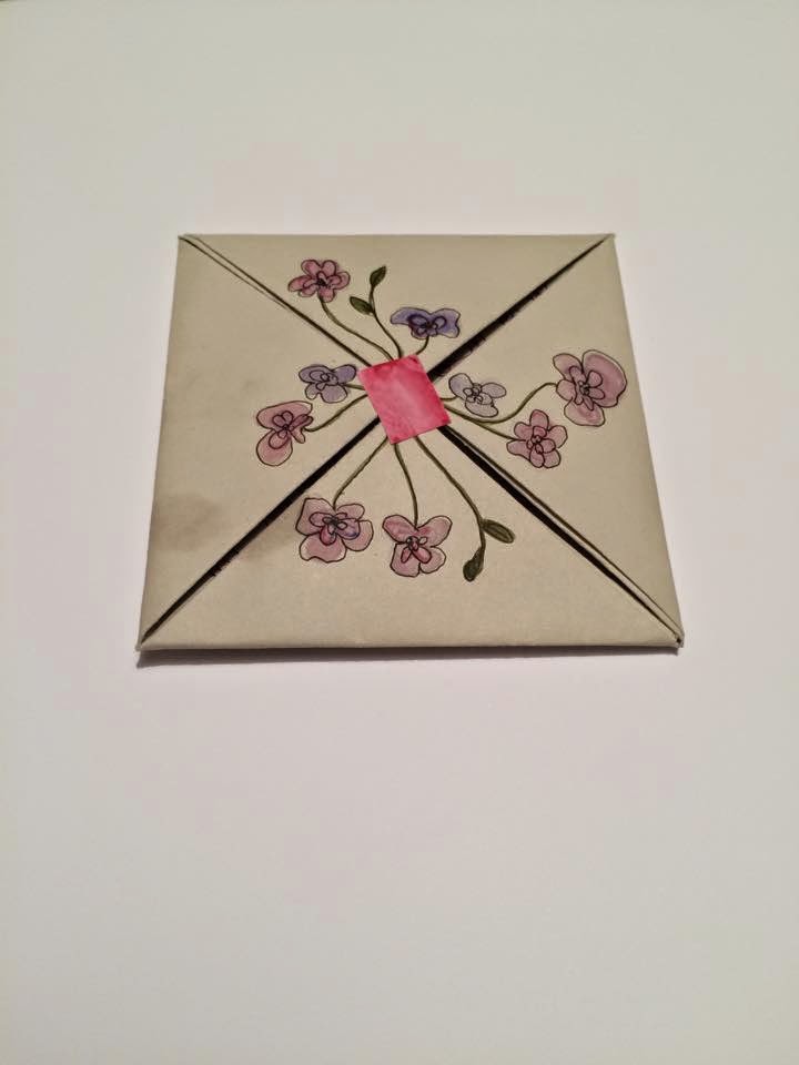
This is how my final leaflet looks when folded down and compact. I have added a floral design in the same style as the lettering on the front, and used a little sticker to keep in place. This was definitely the right choice of stock to use, as it was thick enough to be sturdy and not easy to tear, however it is also thin enough to fold as many times as it has been. 


Friday, 10 October 2014

Leaflet Development

Now that I am clear on the layout of my design, I need to start mocking this up digitally so I can get an idea of how the final will look. I am certain that I want to use a serif font, for both bodycopy and headings. I feel that a serif font is more elegant and will suit the style of work that I want to produce for my leaflet. When searching on behance, I came across some publication designs that were the main inspiration behind using a floral composition within my work. The research is relevant to my own practice as I find myself hand drawing a lot of the time, especially anything to do with floral design. I don't necessarily use this within my graphic design work, it is just something I enjoy doing alongside of this, which is why I decided to include this element within this project as the project is a brief relating to my own practice and this is something I enjoy doing. 

These designs I find are really nice as the loose style of pen drawing combined with the watercolour creates an elegant design. This work is the main inspiration for my design, I intend to create nice loose floral drawing, and I also may experiment with colour but I quite like the idea of sticking to maybe just a pen drawing so it doesn't distract the viewers attention from the main focal point, the information. 


I started by drawing freehand some floral compositions, one with colour and the rest with pen.


I like the loose style of this floral drawing, however I am not keen on the colours, I intend to have a background colour for my poster, which suggests that certain colours will clash. I think I will stick to black pen drawing so that it doesn't take any attention away from the information. 


All of these loose compositions are quite nice, however I am still not happy with them to use for my final. To get an idea of what my leaflet may look like, I will mock a version up on indesign using the content I have and one of these sketches.


This is how I will repeat the drawing on the page, with the four column grid therefore the text fits in the centre and the floral illustration. This is a similar colour which I want to use for the background, a simple pastel colour. The main detail will probably be within the title 'my design process'  therefore I think a limited colour palette for the inside will be more complimentary. 

Mock up of final:


This mock up gives me a reasonably good idea of how my leaflet will look and what changes need to be made. I will definitely develop the drawings as I am not happy with how they look once placed on my indesign file, there needs to be a stronger composition and I am not happy with the overall style of drawing, maybe the flowers need to be larger, and not as obvious, I can create a looser drawing where it isn't as obvious that the drawings are flowers and create something slightly more abstract. The font used 'Times New Roman' will not be the final font, I used this to get an idea of how the serif would look, and how the body copy worked within the four column grid. I think the point size of the body copy needs to be smaller. 

I now know what needs to be changed for the inside of the leaflet, I also need to consider what it will look like once folded. I want to create another two hand rendered elements on my design, on the very front when the leaflet is compact, and also when you open it the first time before the poster is exposed. 

When the leaflet is fully closed, this is how the fold will look. I want to add something very simple on the front which compliments the design inside, therefore I will hand draw some flowers from the centre, this mock up shows how they may look, the leaflet will also need a small sticker where my finger is placed in order to keep the leaflet closed before it is unfolded.


When the leaflet is opened for the first time, there is a blank square, which will be the perfect place to include the title 'my design process.' Because there is a hand rendered element to my design, I feel it will be appropriate to hand draw my letterforms and also hand draw the floral design on the very front as shown above. 

This shows where I will want my type to go, centralised within that small square. This is just a sketched mock up of how it could look, I will definitely hand render these letters based on the font times new roman, I also want to include the floral design within the letterforms if possible. This sketch doesn't show this idea very well, however I may use watercolour and define the letters in fine liner so there is a nice contrast between the colour and pen. 


When the leaflet is opened up completely, this is what the back of it will look like.


Thursday, 9 October 2014

Initial Leaflet Development

After deciding that I want to produce a fold out poster, I drew a few thumbnails to start planning how the poster would look visually. I have decided to go for a simple fold that looks more complex than it actually is. The square poster will fold down into a compact leaflet. 

I tested the fold out on plain paper first, and this is how the poster will look when folded.


Now that I have decided on my fold, I want to focus on the design. My initial thumbnails demonstrate that I want my poster to be developed into something rather illustrative and feminine. These are some of my initial thumbnails, working out how I will lay the content out on my fold out poster. I will use indesign to create the insert, with the body copy and images, using a grid to layout my type. 


Possible compositions of the fold out poster, I want to include an illustration of a loose floral design within my poster alongside the information to create a more feminine theme for my leaflet. This will be the target audience, as the design will be simple yet decorative, the idea is that my folded leaflet can be also used as a poster that can be put up on a wall. 


This design is the strongest and most aesthetically pleasing. I will develop this idea, and create a digital version to see how the image and text work together, it is important the the text is legible therefore the page can not be too cluttered. A simple four column grid will allow me to apply my information in a structured format, and this simple idea allows the text to not interfere with the image element of my design.

Tuesday, 7 October 2014

Initial Ideas

After experimenting with different ways to fold during the studio session, I started to sketch out a few initial ideas of how I could present my design process in a folded leaflet format.
This first sketch displays an example of what I folded in the studio session.


None of these initial sketches really stand out to me. With the idea of a fold out poster, I feel like I need to develop these ideas and start designing something that seems more simple as a whole, but has a more interesting way of compacting.

Wednesday, 1 October 2014

Existing Designs

After researching existing folded leaflets and designs, I quite like the idea of creating my leaflet within an envelope. With previous work in level 4 I have created a project using the idea of having an outer cover, but it was not developed therefore I would like to experiment with this idea. 


 This designers work I found interesting, the overall content is quite simple however the packaging and design gives it some unique aspects. I think creating something like this would reflect my own design process as I would say to some extent my design process is rather organised. 

I am not particularly keen on this design, however the style is something that reflects my process. Throughout my design process hand rendered elements are present, which gives me the idea to create my own response similar to this style. The idea of creating something more hand rendered appeals to me as it is a main part of my design process and I would like to develop this further and produce something that contains this element. 

This design is interesting as it seems to be a sheet of paper that has been sectioned and folded in different ways to create a more unique design.

Format

Knowing that the final outcome must be a folded leaflet of some format, I wanted to look at some existing examples of a folded leaflet. It can range from anything simple or complex, with multiple folds to create different shapes and sizes with the paper. 
Some of the more simple designs can consist of creating a folded poster, which contains all the information, others can be just a simple booklet fold. Some examples of the more simple designs I have found on behance are still aesthetically pleasing however the designs are just not as interesting and complex as I am aiming to create. 


 This design is aesthetically pleasing and uses a clear legible grid layout, but it is quite simple production wise as there is just one sheet of paper that has been folded into rectangular sections which will create a very simple overall leaflet format wise.

This design is a bit more complex, one side of this has been printed but it is folded in a more interesting way, as this will fold up into a triangular shaped leaflet. 


This again is another good example of a simple fold, but an interesting and appealing design. This would work well if the content was 

This design has more complexity to it, but would still be easy to achieve as it is just a folded booklet format. 

Tuesday, 30 September 2014

Design Process

For the first session we came together in pairs and broke down the crucial elements of a general design process. This session was to help us define the key points of design process' and also how each individual has a different method to working, therefore there is no correct step by step guidelines on how to complete your practice. 
The most obvious elements within design practice consist of: 

  • research, primary and secondary
  • crits and feedback
  • thumbnail design
  • sketches
  • refined ideas and design


In pairs me and Ellie created a mind map of the most obvious stages within a general design process, including the most significant parts.


From this we were then asked to develop these mind maps individually to a more personal process. This shows a flow chart style format of the design process which I usually find myself repeating during my practice. Research is a key element, and it is not only where I would start the process, the research needs to be consistent throughout the whole brief. Within the research, both primary and secondary are important, and also looking at existing designers work and products. This chart shows how the research develops into a more refined body of research then onto initial ideas which can include my own sketches, visual representations and generally getting my first ideas down onto paper. Feedback from group crits are very important within the design process, as other peoples opinions can provide a reliable structure for your own practice. It is important to take on board other peoples comments and try to experiment with the ideas they have given you to help improve your work. Once you have come to a conclusion with your work and are confident this will be your final outcome, it is still important to get more feedback to find out if there are any minor alterations that may be needed. 


OUGD504 Studio Brief 1: My Design Process

This brief requires us to develop an understanding of design processes and how we apply them when creating our own work. The graphic response must be resolved into a folded leaflet, and it also must reflect our own design process. The overall aim is to formalise the design process in a clear and well presented format that demonstrates the design process used in my personal practice.