This is what I have come up with for the final flowers. I am happy with this design, it looks a lot more refined than the original sketches, and has more definition. This will be the composition that I will use, and it will be repeated so the image is in the bottom left, and top right corners of the squared poster.

Now I have the final version of the drawing to use, I live traced this in illustrator so that when printed it is more refined. I can now place this image on a background colour ready to produce on indesign. Here I have added my design to a dusky pink background, originally I did not have a border, but I think that it offsets the insert of the poster well. I think the floral design fits well within this border, also allowing enough room for the text.

For the headings I will use the font Bodoni, this is a nice serif font, and it will also stand out from the body copy as it is bold. For the body copy I will use baskerville, a nice simple yet elegant typeface. The two fonts work well together, a sans serif font would not compliment the style of design.
This is how the final version of my leaflet looks digitally, I am pleased with the outcome as the floral designs frame the information nicely, the choice of a neutral pink colour also looks appealing as it is not in your face pink. Now that the two different fonts are together, they work well together, the headings stand out from the main text just enough, and the body copy fits nicely within the four column grids.

Now the digital version is ready for print, I have decided to print it on to a creamy coloured sugar paper. When testing stocks, I found that this was the best because it didn't crease as much on the folds, whereas the thicker stocks seemed to have this problem. Because I want to use watercolour on the outside of the design, I will need to take care when applying because sugar paper is quite a thin stock so the water may disturb the print if too much is applied.

This image shows the hand drawn lettering based on the font times new roman, outlined in pencil with subtle pinks and purple watercolour within. I have also sketched some loose floral chains within each letterforms, in a similar style to the design drawn on the insert.
Below shows the final leaflet with the title hand drawn. I am pleased with the final hand rendered type, even though the letters are quite sketchy and rustic, I think that they suit the hand rendered style I have tried to achieve.

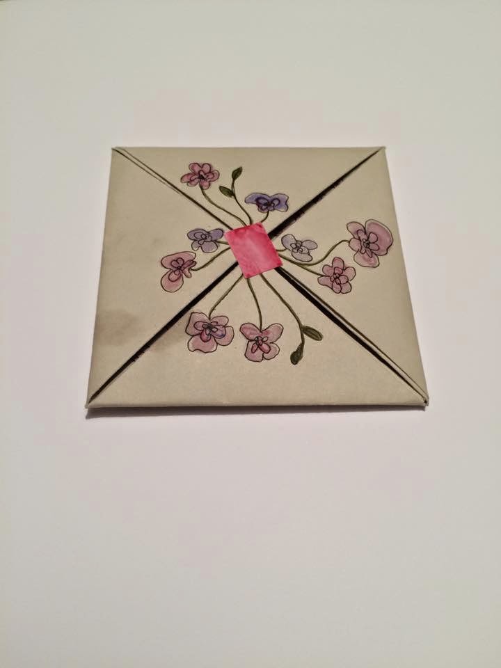
This is how my final leaflet looks when folded down and compact. I have added a floral design in the same style as the lettering on the front, and used a little sticker to keep in place. This was definitely the right choice of stock to use, as it was thick enough to be sturdy and not easy to tear, however it is also thin enough to fold as many times as it has been.
No comments:
Post a Comment