Sunday 30 November 2014

Oh Deer! Pillow fight

Brief
It's that time of year again, our annual pillow fight is upon us! We're looking of course for cushion designs to add to our collection.
Our cushions are stocked by lots of leading brands in the UK and we sell a lot direct to lovely customers through our website, they're one of the products people think of when they think OhhDeer.
We test how popular your products are by putting them in the public domain. You can increase your ranking by getting your posts liked, tweeted and pinned (+ some other activity which you will see within your account) your entries will go on sale as soon as they're approved - you will get 20% of the profit (not the sale price) from each cushion, sales are heavily weighted and will dramatically boost your ranking.
The top ranking posts for the day will be visible at the top of the competition page, on the homepage and could be featured in our newsletters. You can submit a maximum of 4 designs (we're keen to see what your range might look like, so use the spaces wisely!)
How we pick our winners: designs will need to fit within the brand well, it'll need to be contemporary and have been shared by purchased by our audience.

I like the overall brand ethics of oh deer, there fun quirky style of brand really interests me and I think this is a fun brief to choose, as I can design something that doesn't necessarily need to fit a purpose, its just a fun brief. 

Existing oh deer cushion designs:


For this brief, I war to create something fun and quirky, as there doesn't have to be a significant concept behind the design. Creating some animal based designs is what I want to do, I want to produce some designs/illustrations that can be produced on a range of products seen on oh deer, such as greetings cards, postcards and the cushions. 


Taking the idea of using the three circles model to represent animal welfare I want to create a range of designs. I have chosen to draw a trio of woodland animals, there is no real concept for this brief, as the requirements only specify a design that will be suitable to be sold on their website. 


 Hand drawn illustrations to be manipulated


Combining the drawing with colour


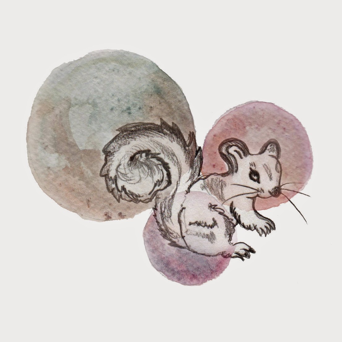
Developed: I added stronger rings of colour to define the design


Final cushions


Final postcards


Research and development

Researching into craft beers and breweries, the beer/bottle label is a perfect way of distributing information about the specific brand or company. The unique imagery creates a story telling the audience a little about the brand. I want to advertise my website through creating a bespoke bottle label that is instantly recognisable, the label could be accompanied by a leaflet or a flyer with further information about my website. They could be distributed to local bars and pubs, alongside a beer mat that includes my logo. As I have no intention of creating my own brew, the bottle labels could be a unique label/packaging for something that is commonly seen in a bar, something that could be part of the décor, or something that is available to purchase. The idea of hand rendering illustration for packaging design is of interest to me, the label could be a packaging on a specific item to be sold in a bar or pub.

Bottle label/packaging:
This pioneer label design has a very distinct style, the style reminds me of vintage signage.


This is another set of designs that I found on behance with a similar style of illustration to the pioneer branding above. This beautiful typographic quality really gives the label a bespoke image, illustration and type would be one route to choose, however I wouldn't be able to produce something so refined as this, therefore I want to try and concentrate simply on the illustrative side of design for this specific brief.


This illustrative logo design uses a nice colour palette. The symmetrical banner works well with the central floral design, this is something to consideration when designing my own label. This label has been used as packaging for a honey jar, but is still versatile as the label can be used on anything. I will stay away from the use of heavy block colours, as my logo uses variations of soft watercolours therefore there needs to be a clear correlation between the designs.


Beer Mats:
These examples of beer mats are a nice selection to look at, their designs aren't too fussy and their colour palettes are kept rather simple. Squared or circular, a beer mat would be a nice piece to produce as I can use my existing logo, which would perfectly suit a circular shaped beer mat. This is a subtle way to advertise my website, however as the design is rather unique it would be noticed more than a standard branded beer mat.


Initial Sketches for bottle label:
My idea to use two different characters initially started form this quick doodle in my notebook, so I decided to play with the idea of creating a similar old fashioned style illustration that I created for my logo, however for the bottle labels, create some slightly more refined styles based upon that idea. 

 
First sketches:


Scanned and refined drawings:


Sketches of hops:
Hops are always seen on some of the more decorative bottle labels, I think creating a background out of some hand rendered hops will fit nicely with my illustrations.

 
Sketch with watercolour:

Refining my sketches:
Used a colour for the stroke of each character picked from the purple tones within the hops, the images will remain line drawings and I have thickened the stroke weight so the illustrations are more prominent.


Use of watercolour, then refined with a fine liner for definition: