Friday 31 October 2014

Initial ideas and scamps

Now I have gathered my research, and researched into basic web design, scamps, and canons I now need to start my initial sketches to then develop into more detailed scamps. At this point I am still not one hundred percent certain of the exact content which will go on each web page, therefore these initial thumbnails and scamps are a basic idea of how the content could be presented on the page, taking into consideration images and body copy.

The images below show my initial thumbnails. After researching existing websites, I have decided that mine will not be over cluttered as I feel the more effective websites have less going on, which makes it visually pleasing. 


From the thumbnails, I have started to draw out some more detailed scamps illustrating possible layout solutions. 

This layout shows a simple design, I have used the De Graaf canon we learned in the studio session to create the content area. On this, the content will be centralised all the way down the web page, with negative space either side of the images and body copy. The heading for the specific page will be placed in the left blank section at the top therefore it is prominent on the page and is not mixed in with the content. 


This scamp below is similar however I have not used a De Graaf canon on the page, and the content is aligned to the right leaving negative space on the left hand side but not the right. I definitely want to include negative space on my web pages as it is a fundamental parameter in web design. The web designs have to be tailored so that the end user has the easiest experience reading the content. If a design is too cluttered then it becomes hard to tackle, and the design does not provide a clean, readable experience. The negative space declutters the design of a page and helps draw the users focus to the content on the page.


This design below also has a similar design, using the negative space as part of the page design enables the viewer to focus on the content which is clearly centralised. I have included the navigation bar in the top left corner of the page, and the heading of the page in the centre at the top before the content is listed. 


This scamp uses the De Graaf canon for the container again. I feel like this layout is too cluttered to be developed into a web page, after research into existing web pages and how they are designed, I want to keep the layout of mine rather simple yet consistent throughout each page. Not necessarily exactly the same design on each web page, but I want the website to flow therefore consistency will be an important factor to consider. 


Thursday 30 October 2014

OUGD503: Working with briefs. Yahoo

For this brief we are required to come up with a concept as if we were to recreate this and complete the brief properly. 


In groups we looked at the brief and deeded to break down what the more important elements of the yahoo website were, as the existing is far too cluttered and an excessive amount of information that clutters the web page. 
Below shows a screenshot of the yahoo site. 
As a group we decided that the web page is trying to include far too much information than what is needed, therefore the initial response would be to simplify the excising web page and redesign it to focus more on the significant elements rather than include everything on one page. 

From analysing this page, it is obvious that there are far too many tabs and too many news stories. If the amount of news stories were cut down, enabling the audience to focus on stories of higher importance, it will grab the audiences attention more, in our group we considered having a feature on the website that allowed the audience to refresh the stories themselves when they desire to read a different article, this will allow the web page to be less cluttered. 


As a group we also thought about Yahoo, and the target audience. It became clear that Yahoo answers isn't a very popular feature of the website, therefore we thought about making this a main feature when redesigning as this seems to be the most popular. 

Proposal
We decided as a group to refine yahoo down to a synchronised platform that includes other yahoo owned sites, for example, tumblr/flikr/answers. We want to redesign thew yahoo homepage to a cleaner site that is much easier to navigate. We want to do this by creating a one page site that scrolls down though the categories with the navigation bar a the side of the page to jump to different sections. 

Wednesday 29 October 2014

User Experience Design

User experience design (UXD or UED) is the process of enhancing customer satisfaction and loyalty by proving the usability, ease of use, and pleasure provided in the interaction between the customer and the product.

The user experience is the totally of end users perceptions as they interact with a product or service. These perceptions include effectiveness (how good is the result?), efficiency (how fast or cheap it is?), emotional satisfaction (how good does it feel?), and the quality of the relationship. 

What is user experience? 

Hassenzahl and Roto (2007) state the case for the difference between the functional view of usability and the phenomenological view of emotional impact. 

'Design for the wild' - design in context.

The application of user research in the development and production of user interface.
User-centered-design.
The purposeful engineering of user experience through the application of UXD technology. 

Garretts model for user experience design, from the first to final element. 

  1. Strategy - user needs/product objectives
  2. Scope - functional specifactions/content requirements
  3. Structure - interaction design/information architecture 
  4. Skeleton - interface design/navigation design/information design
  5. Surface - sensory design

UXD Methods
  • user research - Real life user research: goals of particular user groups, attitudes and behaviours while completing goal. Observations questionnaires etc. 
  • personas - Documents that describe a user type based on research. Personas describe a specific person who acts as an exemplar of a specific group. 
  • content strategy
  • site maps/task flows
  • wireframes
  • A/B testing
What is a persona?
A persona is a representation of a particular audience segment for a website/product/service you are designing , based on various types of qualitative and quantitive research. It captures a persons motivation, frustration and the essence of who they are.

What is a wireframe?
"A staple of user experience work, a wireframe is a skeleton of a page. It shows the priority and he organisation of things on the screen and how users will get to other parts of the site. Wireframes range in fidelity from quick sketches on a whiteboard to detailed computer renderings. While wireframes will vary in their level of detail, they generally reflect the designers ideas about the placement of elements on the page, the labelling of elements, site navigation, and how the user will interact with the site?"


http://viget.com/inspire/ux-101-the-wireframe1


Tuesday 28 October 2014

Study task 6: New Media


What is new media?

New media has had a significant effect on three of the most essential categories of society in the twenty-first century which are; economics, politics, and the exchange of ideas.

Some examples of new media:

  • websites
  • audio streaming and video
  • email
  • web advertising
  • online communities
  • virtual reality environments
  • mobile computing

Friday 24 October 2014

Canons of page construction

Today we learnt about canons of page construction to help with the web design brief. Canons are systems, methods, or approaches to a particular practice. It refers to organising type and image on a page. 

The golden ratio: 

Definition: (term_ - The Golden Ratio is a term (with an astounding number of aliases, including Golden Section and Golden Mean) used to describe aesthetically pleasing proportioning within a piece. However, it is not merely a term --  it is an actual ratio.


We also looked at the Van De Graaf canon. We drew out our own examples of this in the session. From all the connecting points, a grid system like below is created. The outside must have the measurements of 2:3 to create the correct proportions within.


Using the De Graaf canon we then looked at the Muller-Brockman grid in the next canons of page construction. The first stages of this involve:
  1. Determine the type area by using the Van De Graaf canon.
  2. Divide the sections in to two or more columns, separate columns with an intervening gutter. 
  3. Divide the text columns into 2, 3, or more fields.
This shows a Muller-Brockman grid with four columns across a double page spread.


Research Into Web Design

In order for me to start designing my web page, it is crucial to research into how existing web pages look. I want my web pages to be aesthetically pleasing but still keep them quite simple, an over cluttered web page will be too confusing. The aim of an effective web page is to visually communicate information sufficiently, and have the understanding that others will view our designs in terms of relationships is a crucial part for effective web design. 

From my research at looking into different packaging designs for alcoholic beverages,  looked at one of my favourite design companies for this area, Stranger and Stranger. I found that their website was simple yet very aesthetically pleasing. 


The images above show the same home page just with different images. The homepage automatically switches to another image after a few seconds. Because the homepage is so simple, this element entices the viewer to continue viewing. The Stranger and Stranger website immediately displays their unique work, as each of these images are individual designs, which works exceptionally well in order for the company to display their work without the viewer having to search, this works well as a tool to get the viewer to continue to look at their web page.  


This image above shows the same website but a different page, I selected projects in the sidebar to navigate me to another page. The layouts of the each page are consistent throughout the whole site which enables the site to flow better. If each pages design were very different from one another then the site would not function as well as it does.

I also came across this project on behance, a web design for a diner/bar. I really like the style of this design, as the simple colour palette is very complimentary to the minimal style of design. The content of the web pages such as the menu has all been centralised, which gives each page a clean, simple yet pleasing aesthetic.  


Everything is centralised apart from the navigation bar at the left hand side. This does not draw away focus from the main content of the website. 


This site below remains simple yet very aesthetically pleasing, the simple colour scheme is also nice as they work well with the simplistic style of design.


Thursday 23 October 2014

Designing for web: My website

In order to start further research into web design and development of my own website, it is important that I know what needs to be communicated to the viewer and how I will do that, taking into consideration the purpose, the target audience, and what does the audience need.

Purpose
The website should be a respected source of information and help. The viewer wants quality information presented effectively. The website has to communicate effectively and vacillate the needs and wants of the viewer efficiently and elegantly. I want my website to showcase the different designers work and how unique bottle packaging/branding can be. I also want to look into vintage styling within graphic design and show existing work, I want to look at how this sort if design has developed through the years. 

Target Audience
The target audience will be creatives who's particular interests lie within this area of graphic design. My showcase style website will provide the user with further knowledge on the subject area, include design work from other well known design companies and inform the viewer about each. The target audience will be creatives who appreciate this style of design already, and hand rendered style typography is used on many labels and packagings I have collected therefor it will be useful to also include information about this area. 

What does the audience need?
The audience needs to have basic knowledge of the subject area and to have general understanding that the purpose of the website is to provide further information and showcase other designers work. 

Tuesday 21 October 2014

Designing for web

To introduce us to web design, we have timetabled sessions to help us with this brief. The first session we had today was very helpful and I was able to learn the basic fundamentals needed to know for web design at this stage. Some of the key points I have learnt include:

When coding a typeface on a style sheet, if the typeface has multiple words, the typeface must be put into speech marks. For example; "palatino linotype". It is best to choose several typefaces and type them in order of preference incase the first choice is unavailable for use. 
A style sheet can be used for the format of the web pages, it is simply linked to the html. 

Sketch of how the webpages will link. The stylesheet can be linked to all. 


Friday 17 October 2014

Final logo design

Final logo:
I have opted for a subtle grey, still keeping the neutral tones, but if branded on the product it is still very visible and prominent.
 
 
 Mock up of logo on product:

Thursday 16 October 2014

OUGD503 Studio Brief 1: Individual Practice


For this brief we can also work collaboratively. We are required to to select and resolve a range of live and competition briefs appropriate to our own individual and emerging practice. We can choose five live/competition briefs.

Logo development

Creating the logo as a vector image:
I started by turning my sketch into a vector, these below are my first attempts, however I do not like how they have turned out. They are too wide, I definitely like the one without a fill colour as well.


Same logo with type:
I prefer the logo alone without type, the consumer will already know what the product is therefore they do not need to be told.
 
The centre logo on the top is one of the strongest, I will use this design, however black is too harsh for the natural and minimal brand, I think that a soft grey or neutral tone would work best. 


Wednesday 15 October 2014

OUGD504 Studio Brief 3: A Brief History Of..

For this brief, we have been asked to design and create a functional multipage website based on the summer brief completed. The website must inform the user about useful information and interesting facts. Consider various content of the website, also what is the purpose, who is the target audience and what does the audience need? 


Logo: developing ideas

I started to sketch out some ideas which I presented in the crit:


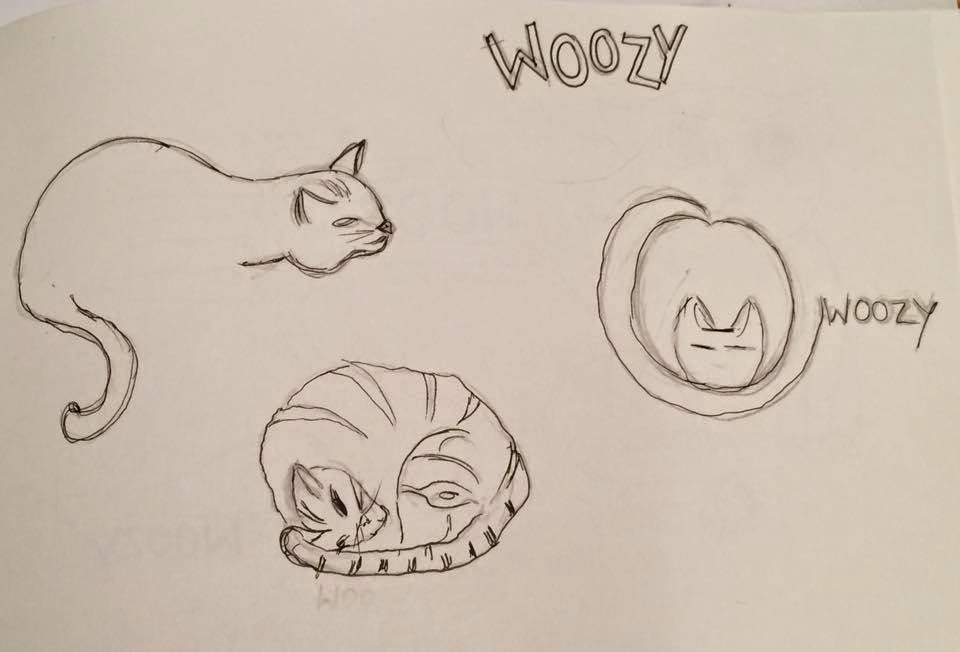
These are the initial sketches I presented in the crit, some of them my peers liked, however I pointed out myself that these ideas were too obvious for a product designed for cats, therefore they needed to be simplified. I also raised the concern that 'wohood' represents minimal and sleek design, which these sketches do not, therefore it is important to develop a logo that represents the brand well.
 
Developed sketch ideas:
After the crit I knew I needed to develop the logo into something more minimal, so I started playing around with using the character 'W' and interpreting this into a logo. The sketches I have created, without meaning to have created a simple silhouette of a cats head, using just the letterform and a curved line. I want to develop this on illustrator as I quite like the idea of creating something so simple, yet it still represents the product.


Tuesday 14 October 2014

Chosen Kickstarter

Woozy Cat Hammock
 briefly researching some of the chosen projects I had narrowed my choices down too, I chose to design a logo for the product 'Woozy Cat Hammock' from the company 'Wohood'. In order to start designing a logo for their new product, it is important that I do some background research as to what their company and brand is all about. Wohood was founded in 2013, and the brand expresses its love for natural products. They emphasise nature, pride and enchantment and this is the brands motive for creating these all natural inspired products. The brand comes up with user friendly creations by marrying contemporary forms with contemporary needs, their products are also environmentally friendly. 

About the Woozy

'The Woozy is an elegant, strong and multifunctional cat hammock/bed made for every interior and suits evert cat.' 

  • affordable
  • part of interior, elegant design
  • combination of cat bed and hammock designed to place a cat close to a heat source
  • clean and modern design
  • brand has a love for natural products 
  • use recycled fabrics
  • wohood: synonymous with nature
I began thinking about what I could research, and summarised the existing knowledge I have gained from researching the company;
Natural products, elegant design which looks nice in a home or used as home furniture, other products for cats, existing modern and elegant logo designs. 

The Wohood logo:
The existing logo is clean and minimal, which represents their brand identity. I want to create something very minimal myself, otherwise it would not fit in with the brand and its purpose. 

Wohood's existing products:
The brands existing products represent their image well, as they are sleek, minimal and very basic. Despite being basic, in this case the less the more effective. If the products were too fussy and extravagant then they would not suit the brand.