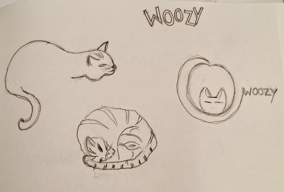
These are the initial sketches I presented in the crit, some of them my peers liked, however I pointed out myself that these ideas were too obvious for a product designed for cats, therefore they needed to be simplified. I also raised the concern that 'wohood' represents minimal and sleek design, which these sketches do not, therefore it is important to develop a logo that represents the brand well.
Developed sketch ideas:
After the crit I knew I needed to develop the logo into something more minimal, so I started playing around with using the character 'W' and interpreting this into a logo. The sketches I have created, without meaning to have created a simple silhouette of a cats head, using just the letterform and a curved line. I want to develop this on illustrator as I quite like the idea of creating something so simple, yet it still represents the product.


No comments:
Post a Comment